
I kept my eye out for interesting fonts on a recent trip to NYC. I found the tried and true:
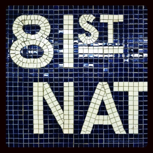
The NYC Metro signage was created in the 1960s and while Helvetica was not originally the official typeface according to the book Helvetica and the New York City Subway System, it became so. Gary Hustwit‘s documentary film Helvetica portrays Helvetica as THE font of the NYC Metro, these days anyway, as well as the face of commerce worldwide.
Despite the pervasiveness of Helvetica in NYC, there are some very interesting deviations. The bold and new:
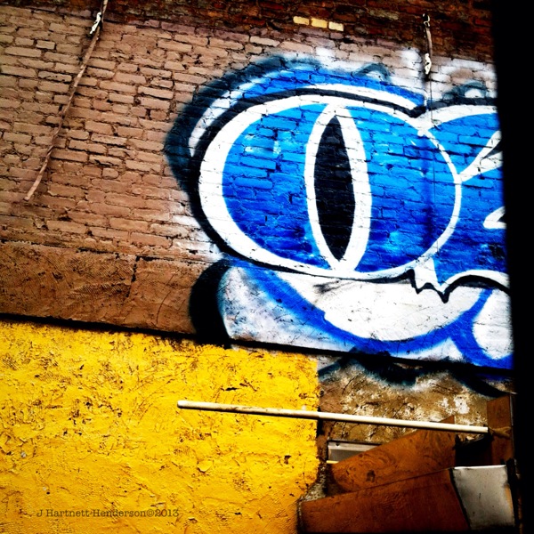
This “O” looks like the eye of a snake or a cat with a vertical iris. The blue is dazzling. It takes four sets of lines to make the shape. I also found a unique font in a printed pasted poster on Kenmare:
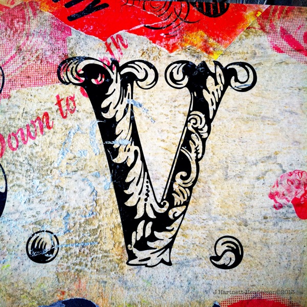
This font looks 3 dimensional with the vegetal design appearing in haut relief over the black spaces.
Lastly, this one on Elizabeth or Mott in Nolita is the quietest but upon reflection, my favorite:

This sign blends the reality of a man named Moe in a cursive flourish with the commercial efficiency of a san serif font, possibly Helvetica, for the “Meat Market”. Sadly, the sign is in disrepair and the floor space below it is vacant, occupied only by a wooden ladder, one suspended light, and the reflection of a building.
Related articles
- Can You Tell the Difference Between Arial and Helvetica? (theindustry.cc)
- I Spy Helvetica (themaxbrettler.wordpress.com)
- New Brooklyn Nets Logo Pays Homage to NYC Subway Signage System (smartsign.com)
- Film Review: Helvetica (rosslangager.com)
- 7 Of The Biggest Lies In Graphic Design (fastcodesign.com)
- Default “Message font” in Mail changes to Helvetica (discussions.apple.com)
- Extensis Font Detective Thomas Phinney Reveals Secrets of Cracking a Forgery at WebVisions NYC and SXSW 2013 (prweb.com)
- Another Look at Helvetica (aapatawaran.com)
